AeroMexico
BrandingObjective: Re-brand AeroMexico in a new light.
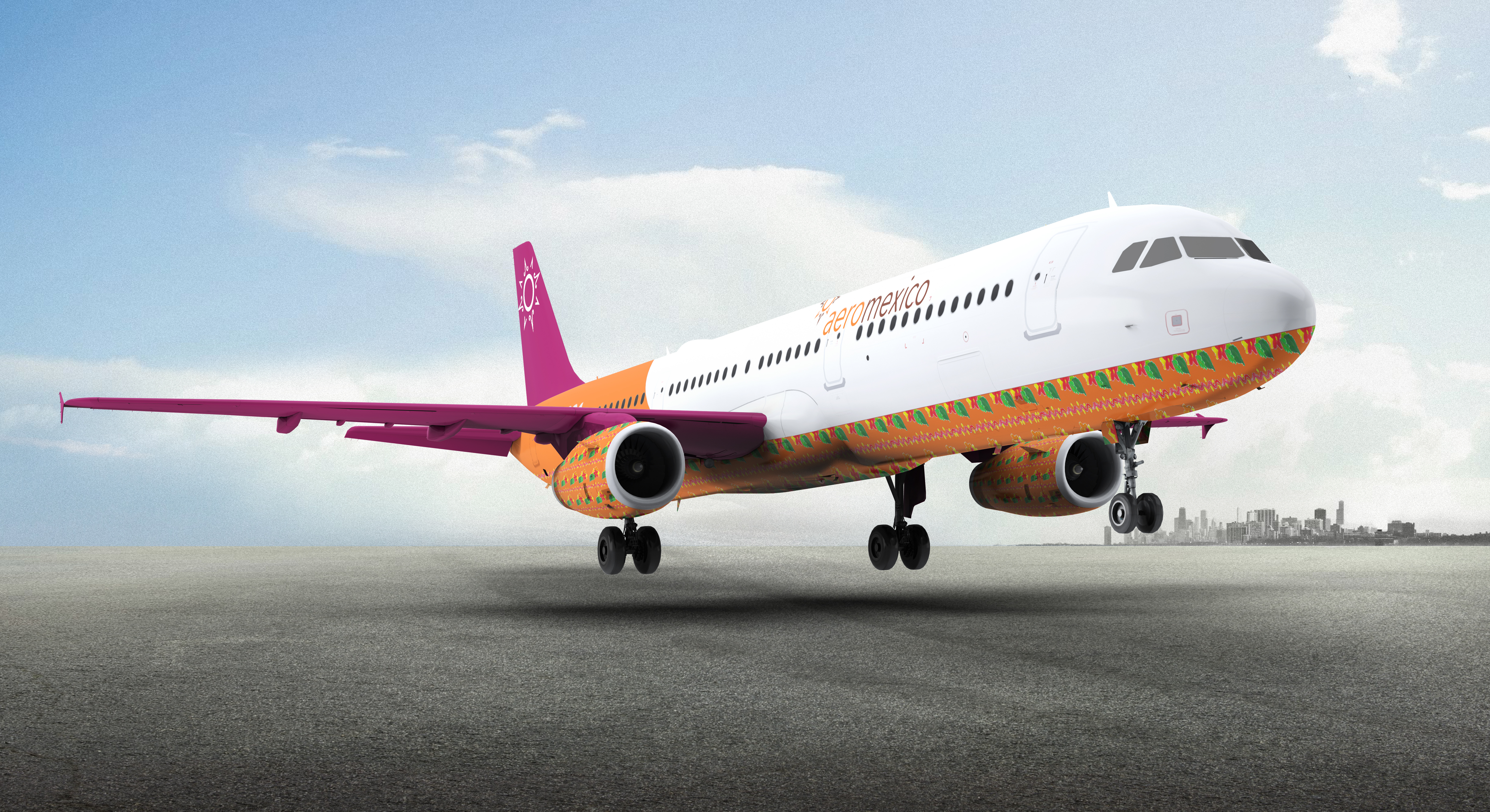
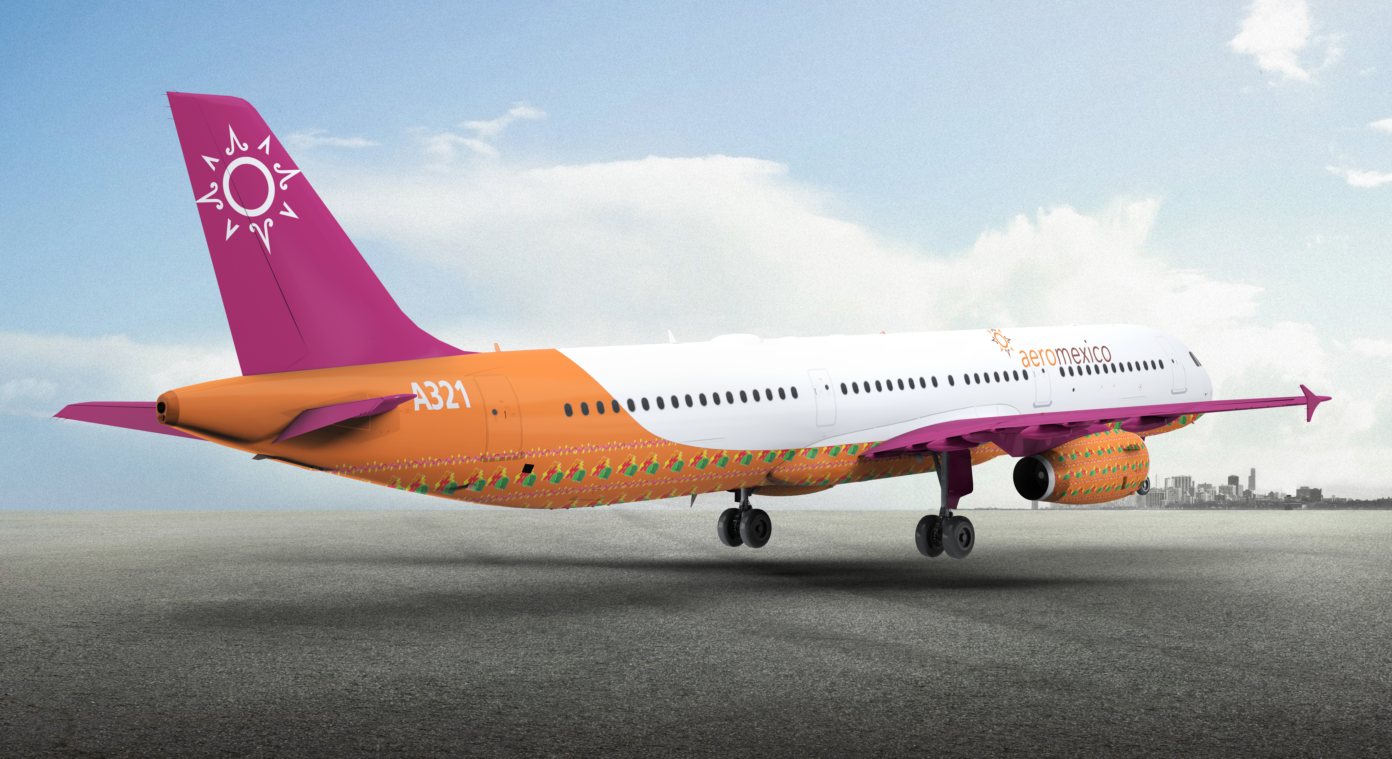
Customers will be able to enjoy the rich culture of Mexico from the moment that they step into the plane. Using bright colors as well as using a recognizable symbol from the culture, the fuction of the AeroMexico rebrand is to celebrate the culture in Mexico.
Customers will be able to enjoy the rich culture of Mexico from the moment that they step into the plane. Using bright colors as well as using a recognizable symbol from the culture, the fuction of the AeroMexico rebrand is to celebrate the culture in Mexico.
Logo
Before
![]()
After
![]()
Keywords:
punctuality
culture
direction
friendly
safety
punctuality
culture
direction
friendly
safety
The logo mark reflects Mexico’s people, the people of the sun. Sun gives the
logo warmth, family, and the sense of
earth. Because AeroMexico is a global
airline, the 8 triangles symbolize direction like a compass. Compass also represents safety. “You know where you
are at all times.” The logo is advertently
shaped as an Aztec calendar to symbolize punctuality. The circular movement and the thick outline of the circle
in the mark gives the sense of Mexico’s
strong community.
Posters


Advertising


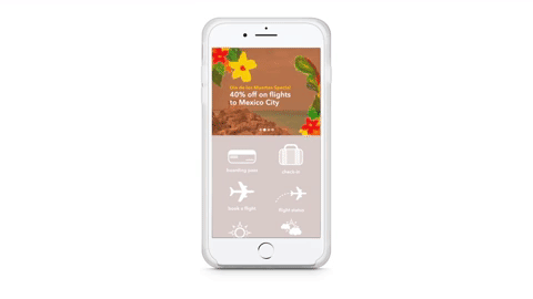
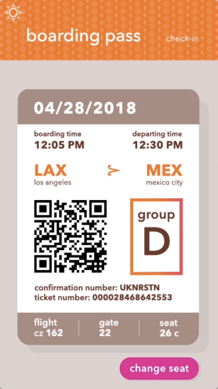
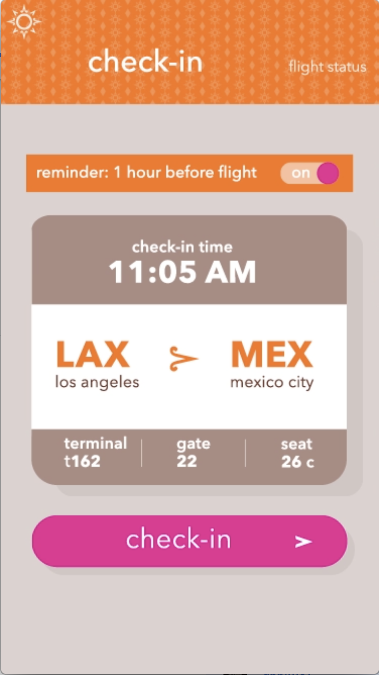
Mobile App

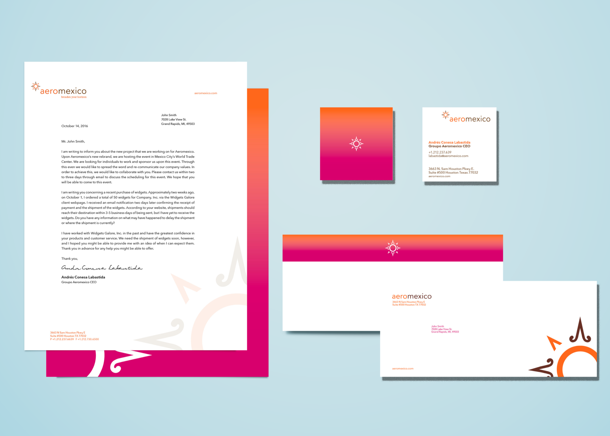
Stationary
Airplanes